Navigation
“And the end of all our exploring will be to arrive where we started and know the place for the first time.”
Going Where We Intend To Go
The Problem
The site's navigation had grown unwieldy, both from a design and development perspective. With more than seven variations depending on where you are, it became fragile, difficult to test, and impossible to maintain. I was tasked with solving this problem while improving engagement.
The Solution
As a result of user testing, we found out that many people didn't realize that we even had a menu, particularly on desktop. 😱 Between our discoveries, metrics, and my personal distaste for hiding everything behind a "menu" button, we decided to do the hard work of figuring out what items should be exposed, how they are grouped, and how screen size effects (or doesn't!) the UI.
My Role
All design except for icons, which were drawn by David Somerville.
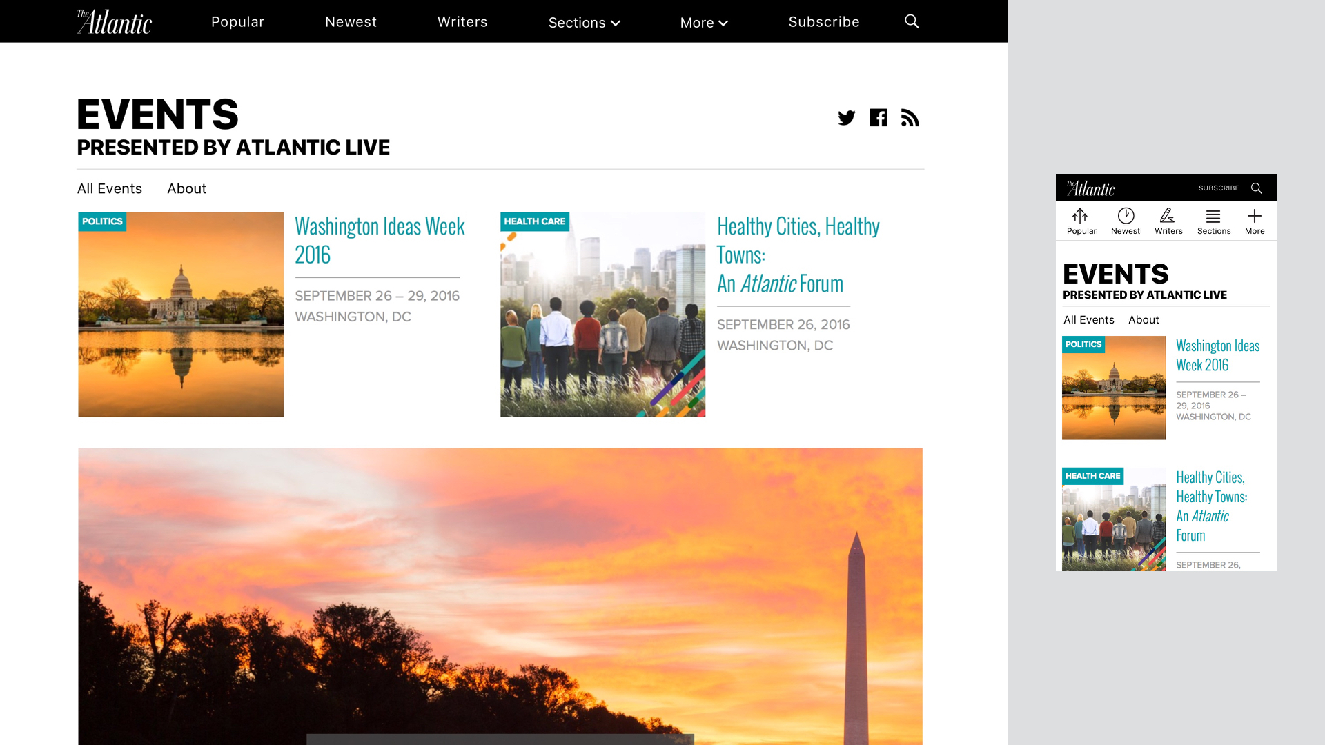
Navigation
Old UI
New UI


Page Headings
In the old paradigm, some page headings were only displayed in the nav bar, as seen below. To solve this problem, I created a new heading and secondary navigation system that is modular and editorially flexible.